Mr. Turtle
A self-service kiosk interface that empowers users to refill sustainable cleaning products and reduce waste.
INTRODUCTION
17.6 billion pounds of plastic enter our oceans every year.
Mr. Turtle is a company committed to reducing single-use plastics through refill machines that encourage customers to reuse containers for everyday essentials like laundry detergent, dish soap, and hand soap. Their refill machines are currently installed in retail stores, laundromats, and college campuses.
ROLE
Product Designer
TEAM
5 Product Designers
TOOLS
Figma, Illustrator
PROBLEM IDENTIFICATION
A mission built around sustainability shouldn't be held back by a frustrating experience.
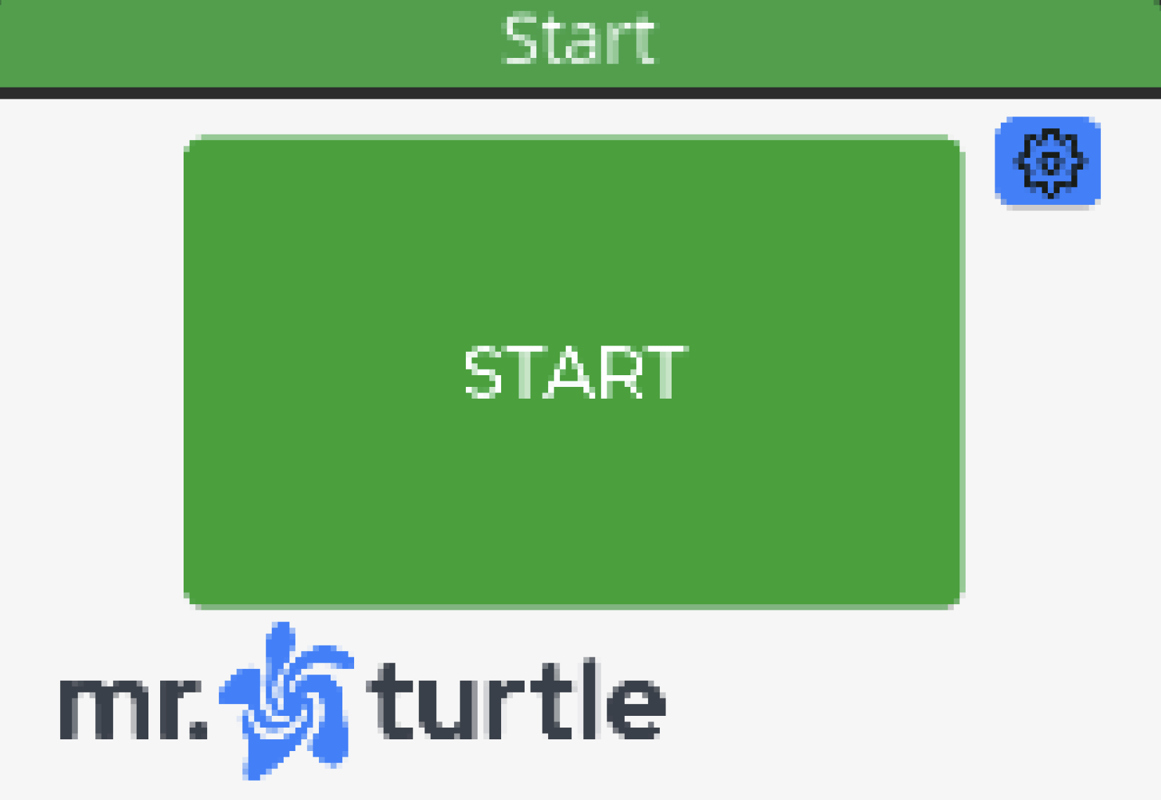
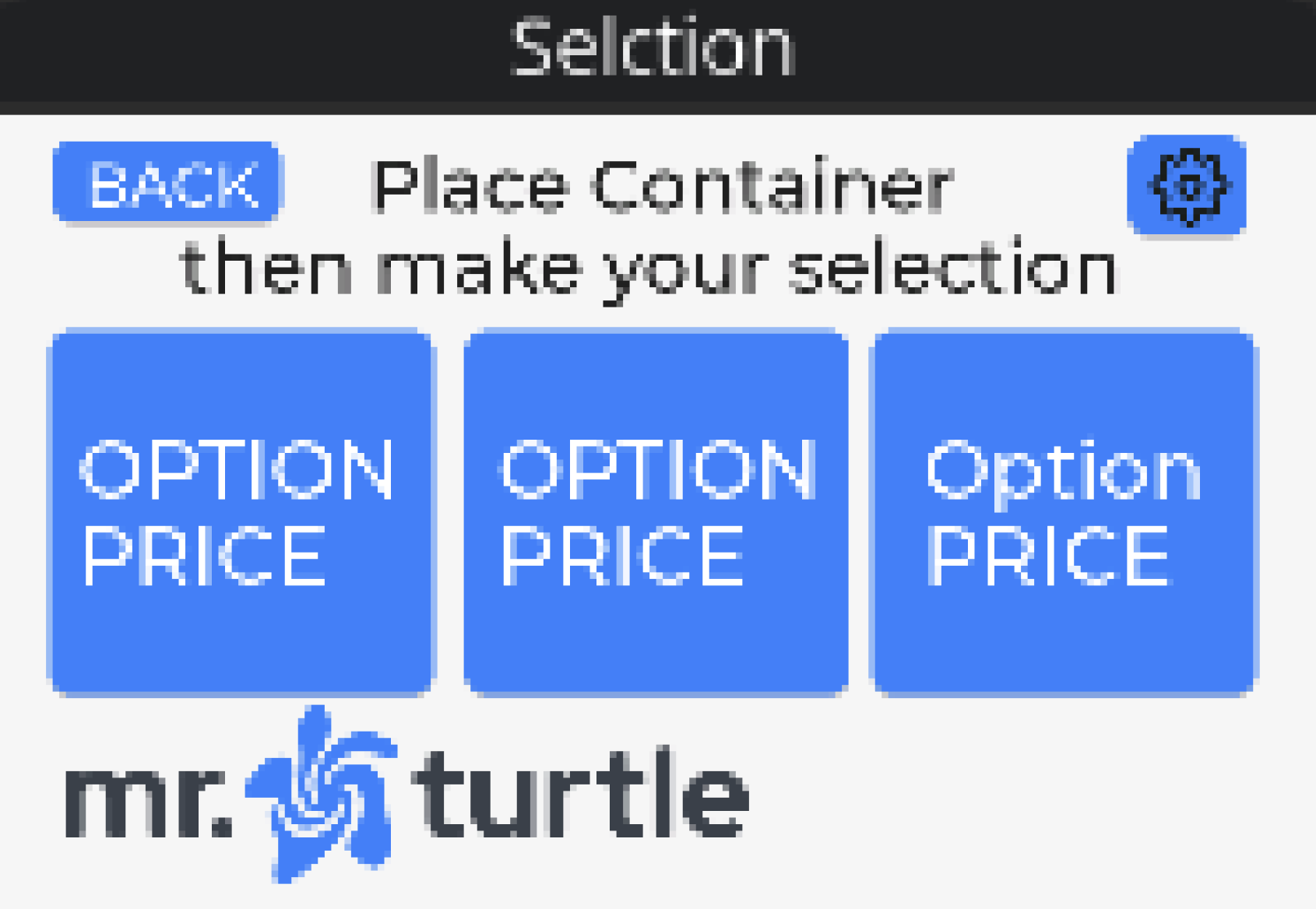
Despite a strong mission, Mr. Turtle’s refill machines had low engagement due to an outdated kiosk interface. The original interface consisted of only four screens, leaving users unsure about what to do and whether their selections and payments had gone through.
The Existing Interface
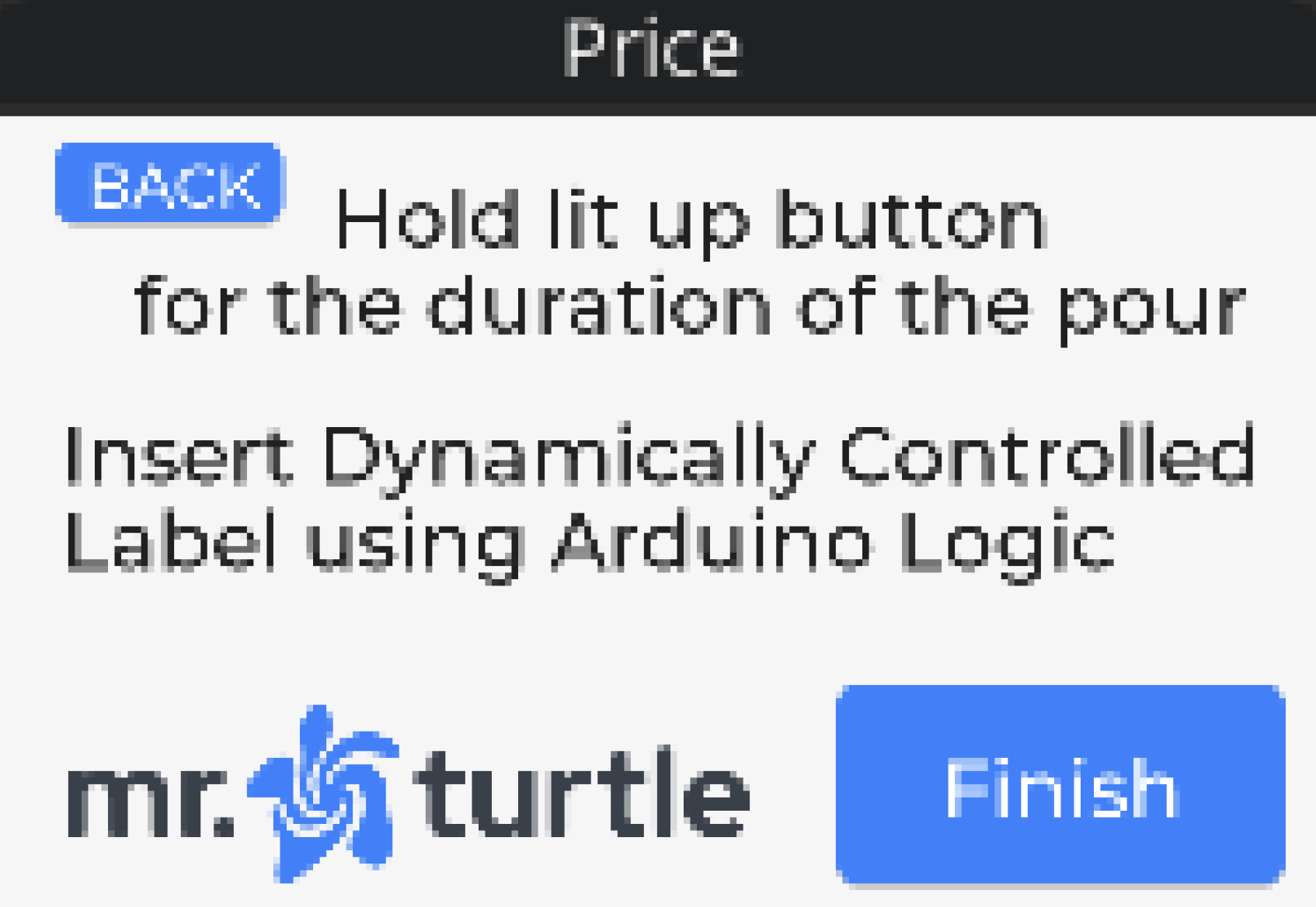
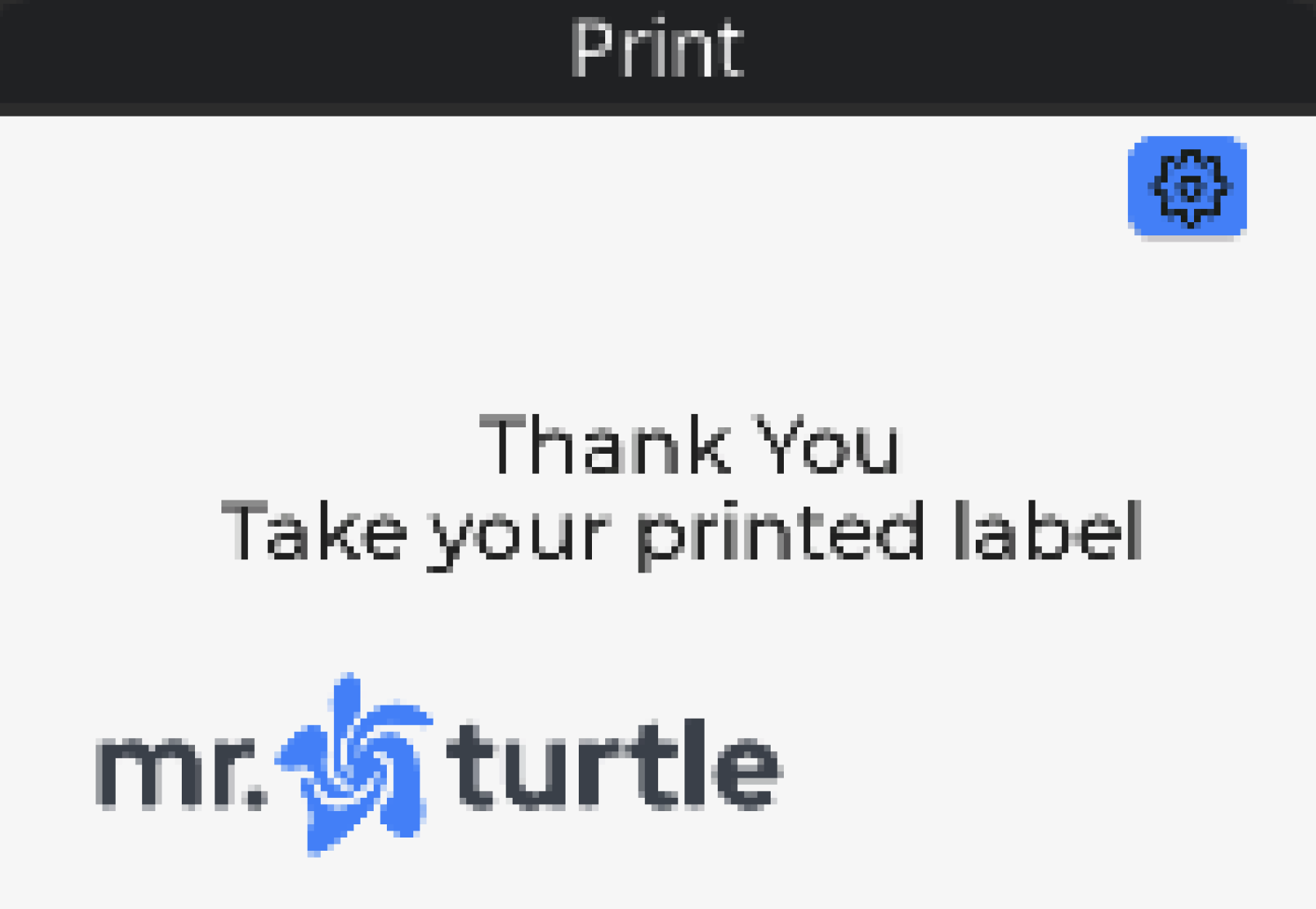
The Mr. Turtle team approached my design team at Cal Poly Iter8 (Product Design Agency) to redesign their kiosk interface and:
Reduce confusion between the kiosk and physical machine
Introduce a rewards system to encourage repeat use
Create a visual experience that better reflected Mr. Turtle's playful brand
USER RESEARCH
How can we make self-service refilling effortless?
Before redesigning the interface, we needed to understand where users were getting stuck. I interviewed 12 participants about their experiences with the existing machine and used their feedback to identify the biggest sources of friction.
Three key pain points emerged.
Product uncertainty
Without product imagery, users had difficulty confirming whether they had selected the right product.Machine errors
When something went wrong, users often needed staff assistance, defeating the purpose of a self-service experience.Confusing instructions
Users weren't always sure whether they should interact with the kiosk or the physical refill machine next.
USER JOURNEY
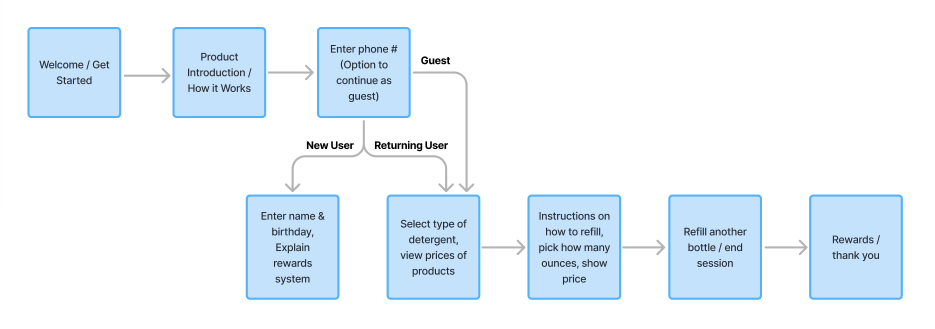
One flow, three types of users
We mapped the experience for first-time users, guests, and returning customers to understand where their needs differed. To keep the experience streamlined, we introduced phone number recognition. Entering a phone number allowed the kiosk to identify returning customers and connect them to the new rewards system.
DESIGN SYSTEM
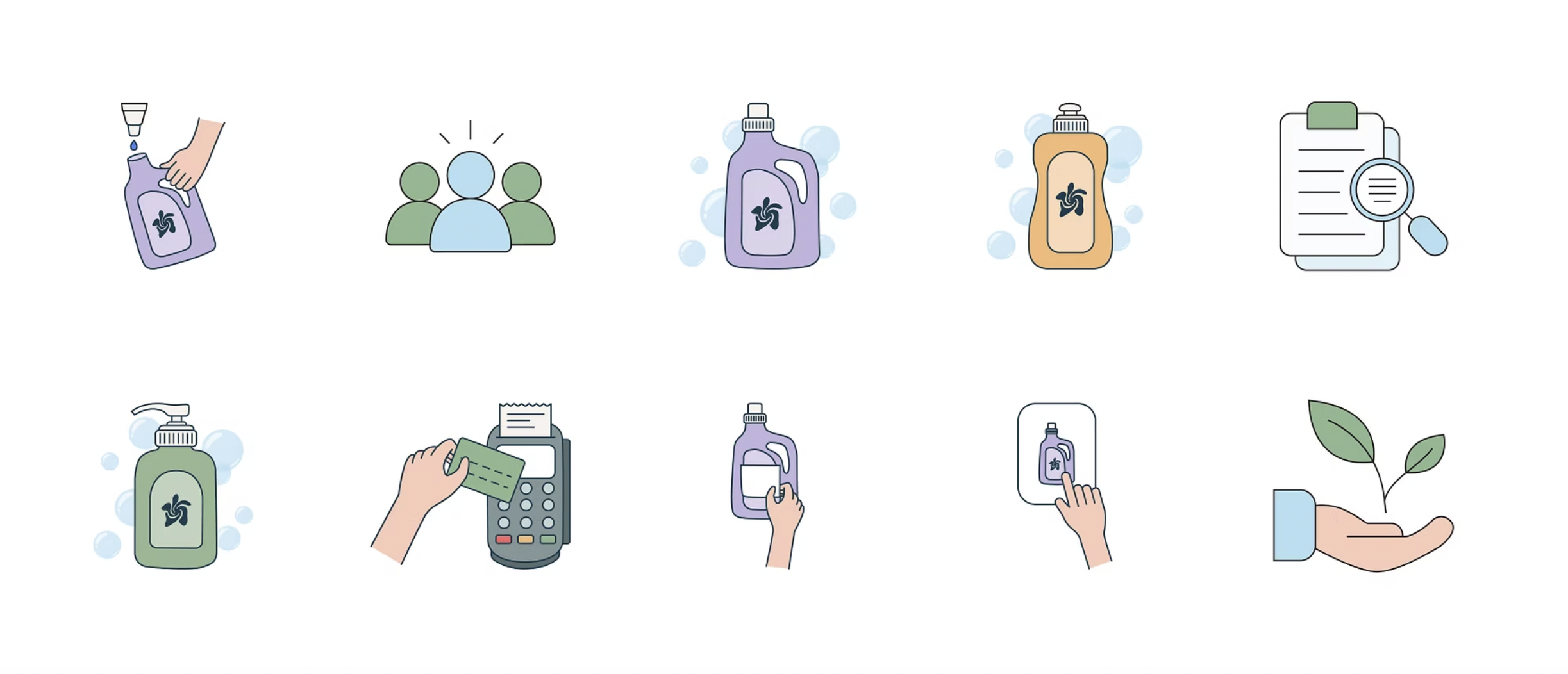
Bringing delight to Mr.Turtle’s brand identity
Rather than relying solely on written instructions, we used custom illustrations throughout the interface to reinforce actions and provide visual cues. All of the kiosk’s icons were illustrated by me in Adobe Illustrator!
IMPROVEMENTS
Iterating based on mentor feedback
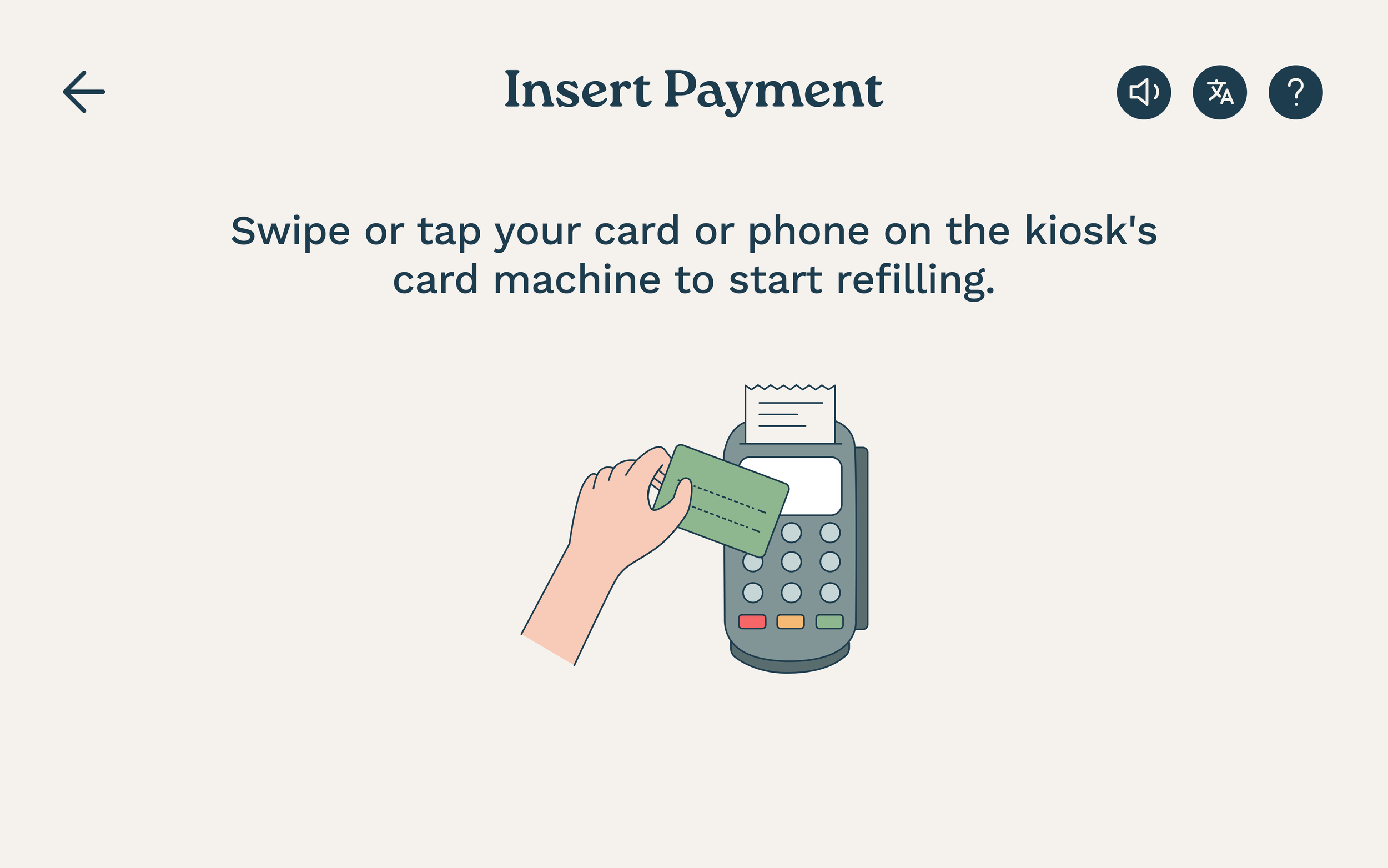
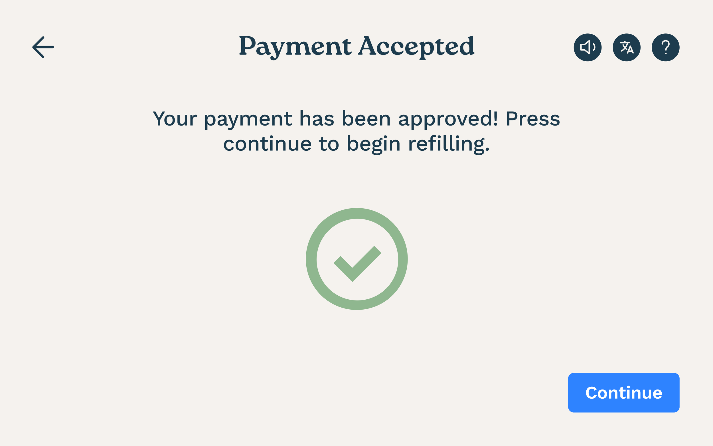
At the mid-fidelity stage, I conducted think-aloud usability sessions with 13 participants across different age groups. Through testing, a major point of friction identified was payment confirmation.
Before
After paying, users received no clear confirmation. The kiosk simply advanced to the next screen.
After
We added a “Payment Accepted” screen to clearly confirm the transaction and prompt users to proceed with refilling.
FINAL DESIGNS
A walkthrough of the full kiosk experience
The final kiosk experience walks users through the refill process step by step, with clearer instructions, product information, payment feedback, and a new rewards system.
FINAL DESIGNS
Extending the redesign to Mr. Turtle's digital presence
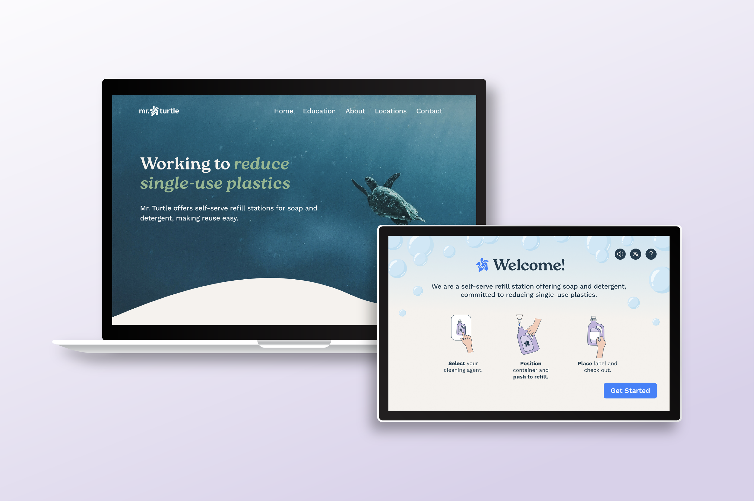
Alongside the kiosk design, we also redesigned Mr. Turtle’s website to create a more professional brand presence for B2B partnerships. The new site communicates Mr. Turtle's sustainability mission while speaking directly to potential retail partners.
REFLECTION
Results & Lessons Learned
Both of our kiosk and website designs were developed and implemented by the Mr. Turtle team! View the website here!
I had a wonderful time collaborating on this project with the founders and developers at Mr. Turtle. I learned so much from the experience, and these are some of the challenges we faced:
Balancing two projects on a tight timeline: Working on both the kiosk and website redesigns limited how often we could test our designs in earlier stages. Therefore, we had to prioritize the most critical usability issues. If given more time, I would’ve done more user testing during the low- and mid-fidelity stages.
Keeping Six Designers Aligned on One Vision: With our team of 6 designers, most of our design work was delegated to each team member and completed individually. In the beginning stages of designing, the screens lacked cohesion due to each designer’s distinct style. However, creating a refreshed brand identity helped ensure visual consistency across all of the final deliverables.
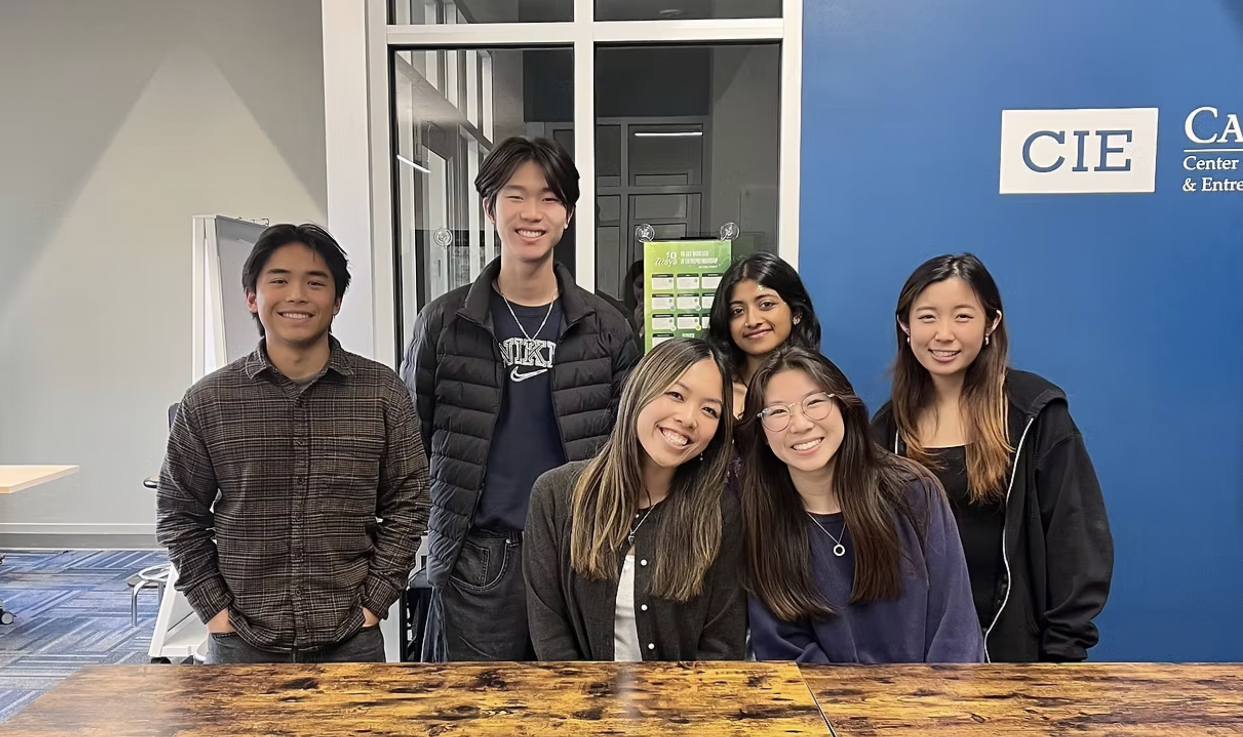
A huge thank you to my incredible team at Cal Poly Iter8 for making this project a success! It was a pleasure leading and designing alongside all of you :)
CHECK OUT ANOTHER PROJECT!
UX/UI • DESIGN COMPETITION • 1ST PLACE
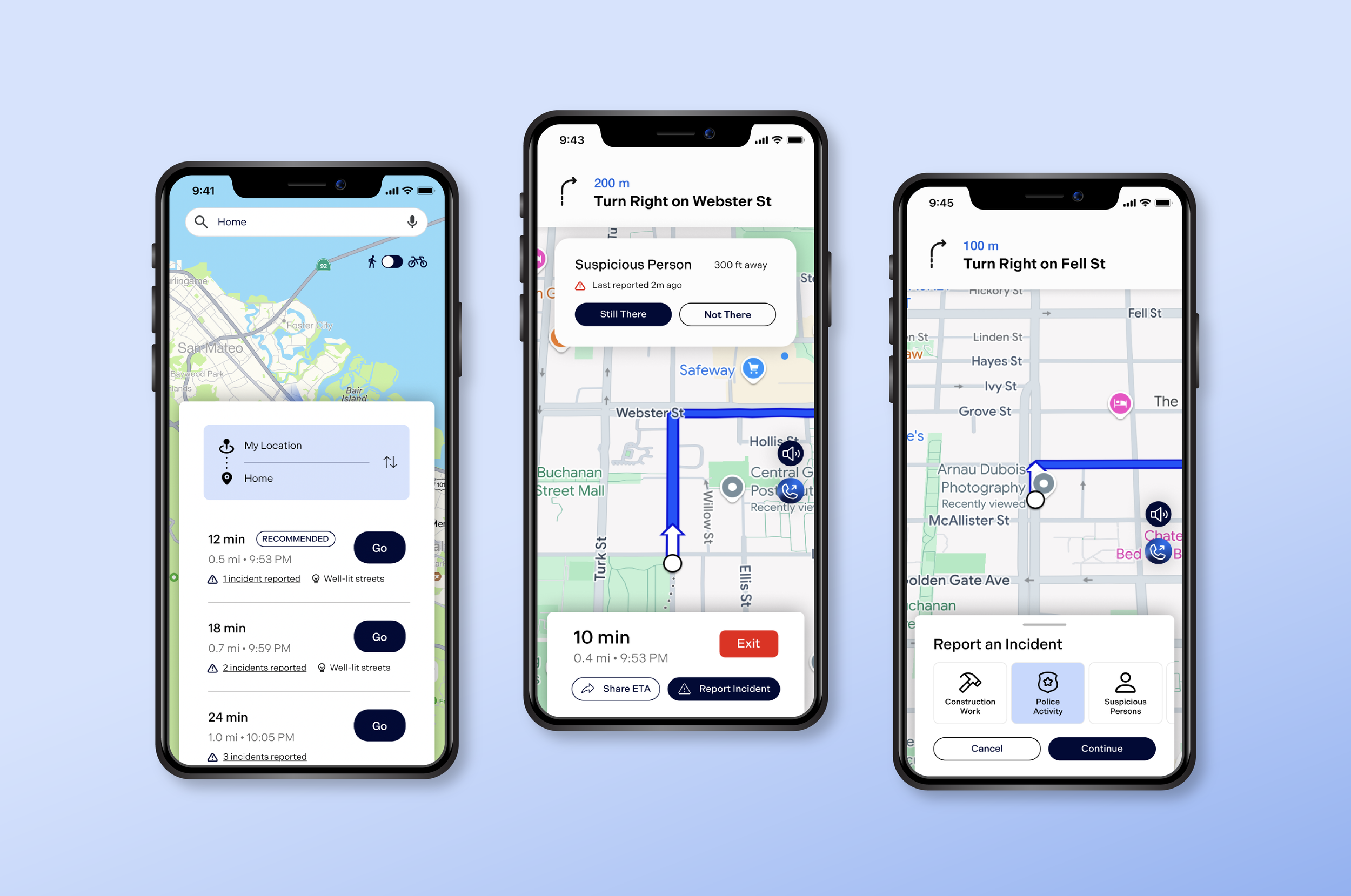
Navi
SUSTAINABLE DESIGN • PACKAGING DESIGN