Pringles Redesign
A sustainable compressible packaging redesign for Pringles potato crisps
INTRODUCTION
How can we make Pringles packaging more accessible?
In a challenge for my consumer packaging class, my team was tasked with redesigning the packaging and branding for Pringles potato crisps. The goal was to create a solution that was more inclusive, accessible, and sustainable, while maintaining Pringles’ brand identity.
ROLE
Designer
TEAM
3 Designers
TOOLS
Adobe Illustrator, Adobe Photoshop, Preps, Konsberg Cutting Systems
THE PROBLEM
Rethinking the Pringles Can
Pringles' existing packaging was designed to address customer complaints about broken, greasy, and stale chips. However, its tall, narrow form introduces a new set of challenges:
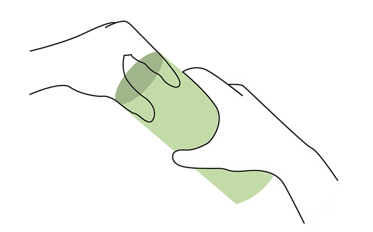
Difficult to reach: As the chips move toward the bottom, the narrow opening makes them increasingly difficult to grab, particularly for users with limited reach or mobility
A messy experience: Users often resort to tipping or dumping the chips when nearing the bottom of the can, which creates an unnecessary mess
Difficult to recycle: The existing can is constructed from multiple materials, including paper, plastic, and metal, making the packaging difficult to recycle
BRAINSTORMING
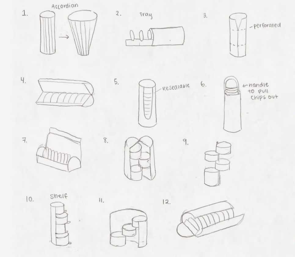
Sketching out initial ideas
DESIGN PROCESS
Refreshing Pringles' Branding
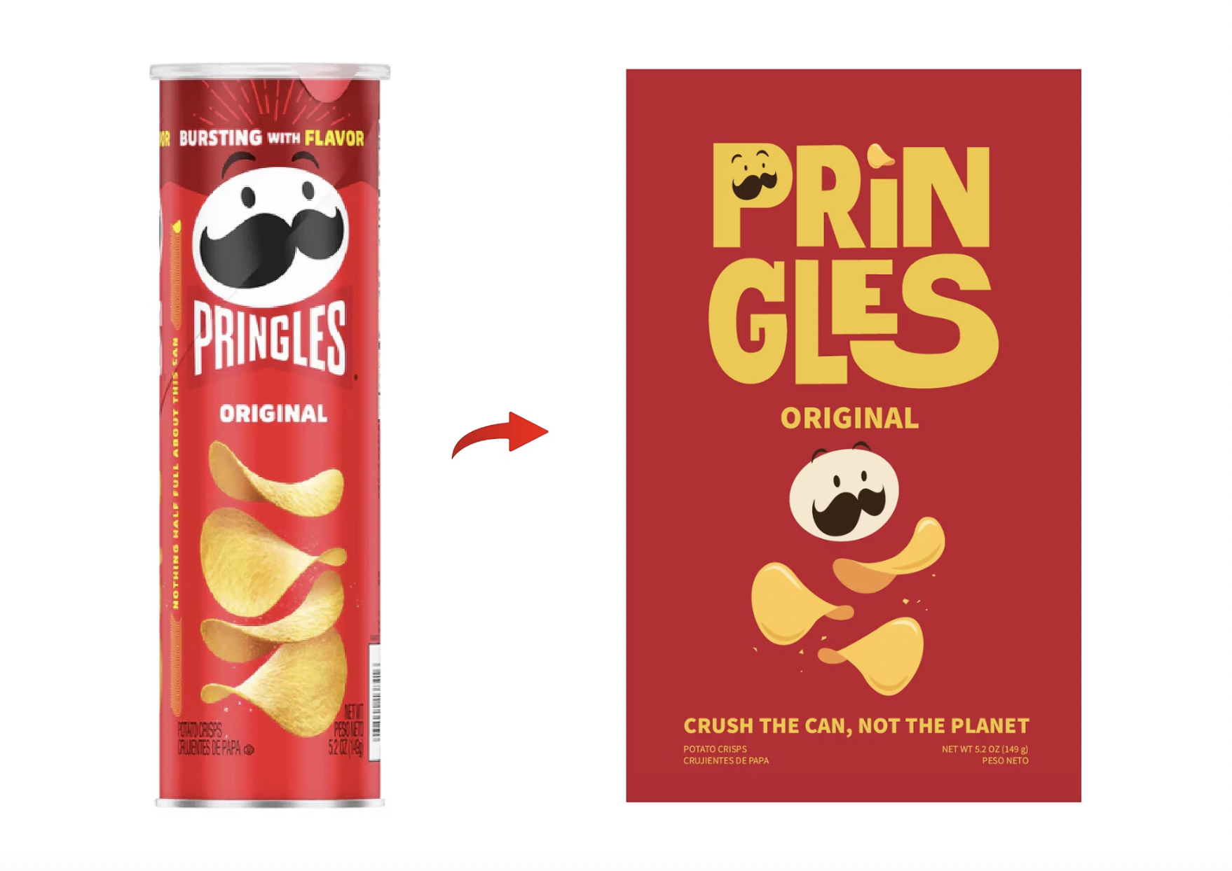
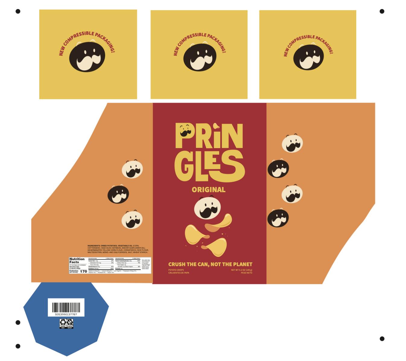
A structural redesign also presented an opportunity to refresh the Pringles brand. I wanted the new packaging to feel modern and cohesive with its updated form without losing the visual recognition that makes Pringles so iconic.
SOLUTION
Creating a can that adapts as you eat
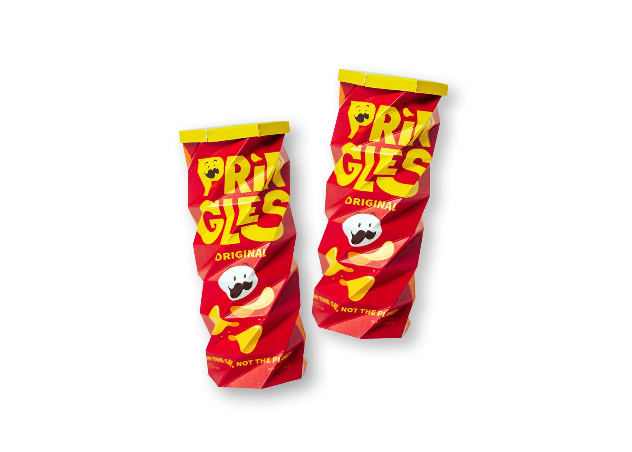
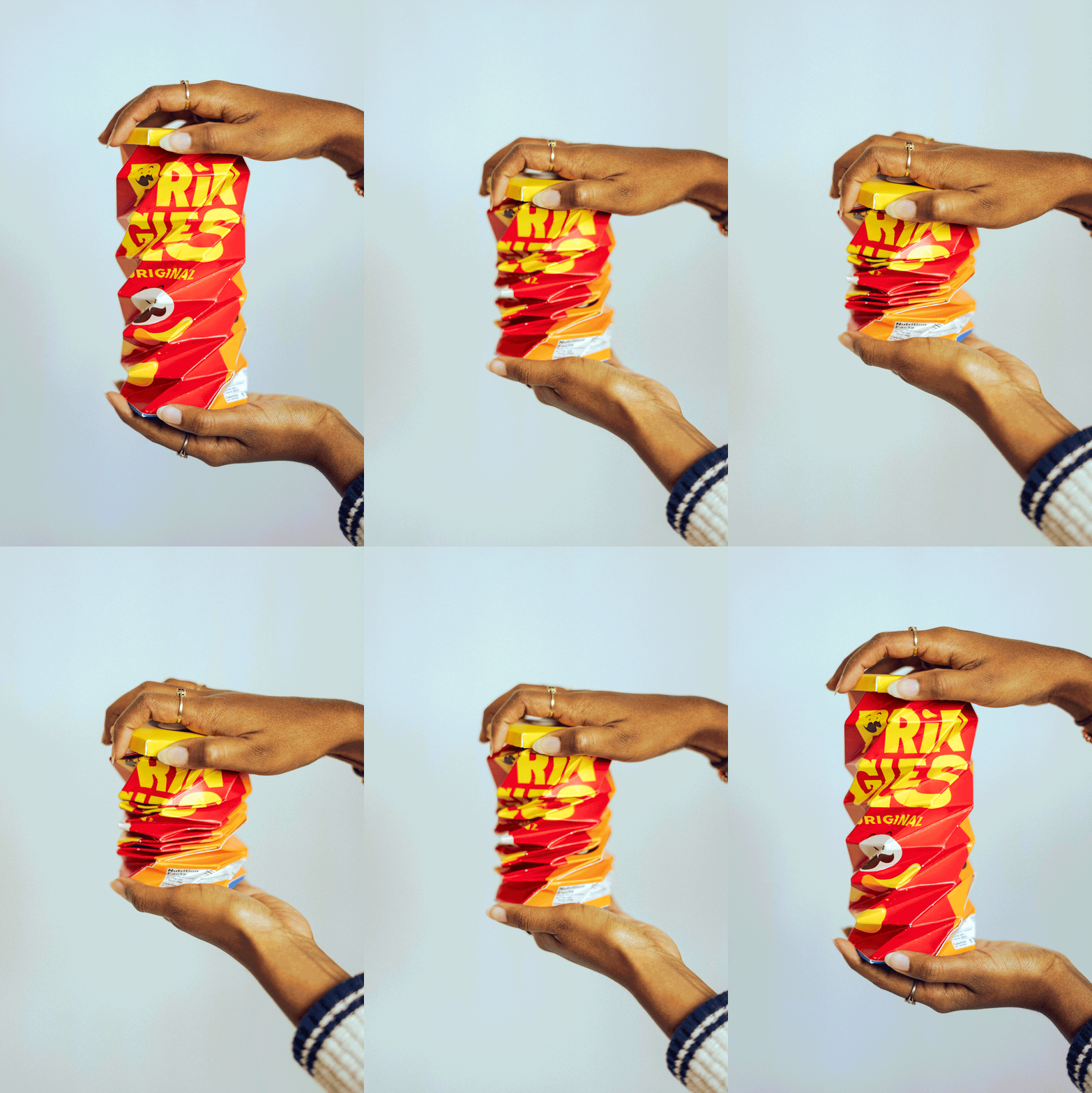
We developed a compressible can that becomes shorter as chips are eaten. This structural change addresses the accessibility issue while introducing several additional benefits:
Accessibility: Compressing the can brings the remaining chips closer to the opening, eliminating the need to reach deep into the package
Storage: As the package empties, it takes up less space, making it easier to store in a pantry, bag, or cabinet
Freshness: Compressing the can after opening could help minimize air exposure, keeping the remaining chips fresher for a longer period
Disposal: A compressed package occupies less volume once empty, creating a more space-efficient solution for recycling

DESIGN PROCESS
Structural Design Iterations
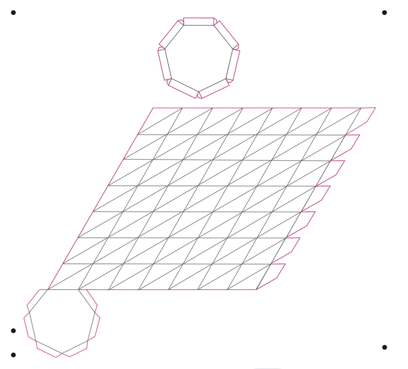
Physical mockups were produced using a large-format Konica Minolta printer, then precisely cut and scored with a Konsberg cutting machine.
Version 1
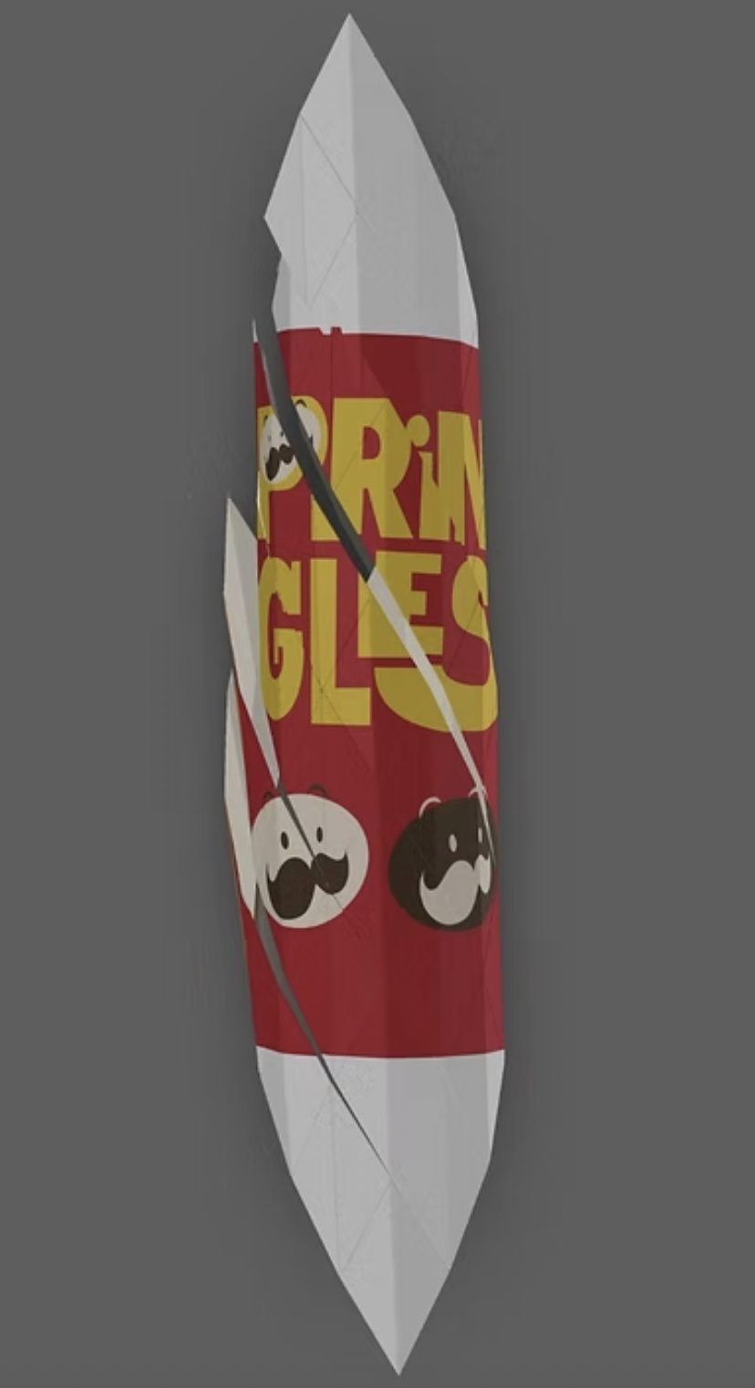
Created a digital mockup using Preps, though it lacked a lid and base and had significant structural issues.
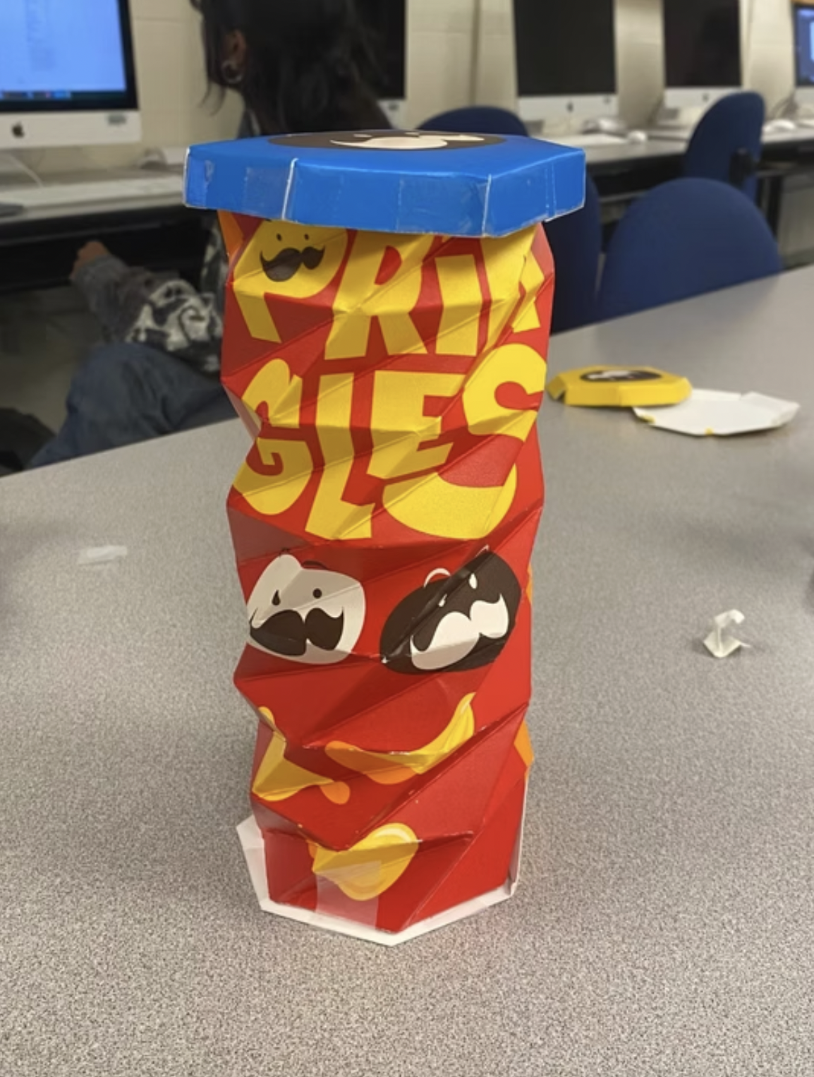
Version 2
A physical mockup was created, but the lid and bottom did not fit properly. Additionally, the can's narrow width prevented chips from fitting inside.
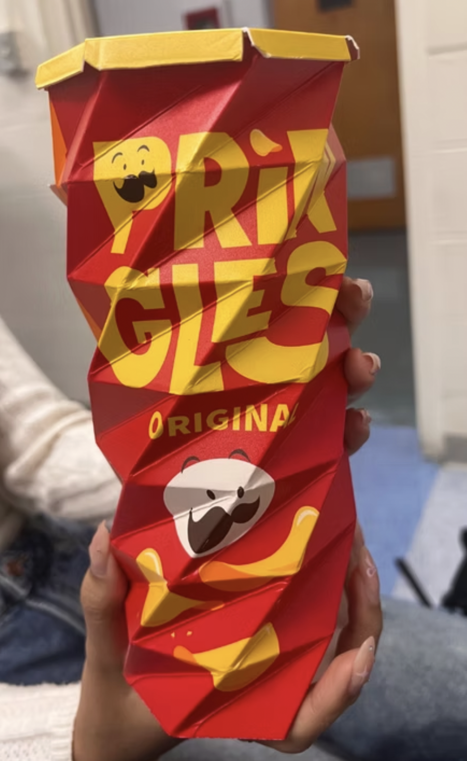
Version 3
Increased the can's width, applied visual design adjustments, and reduced the size of the lid, though it still did not fit properly.
Version 4
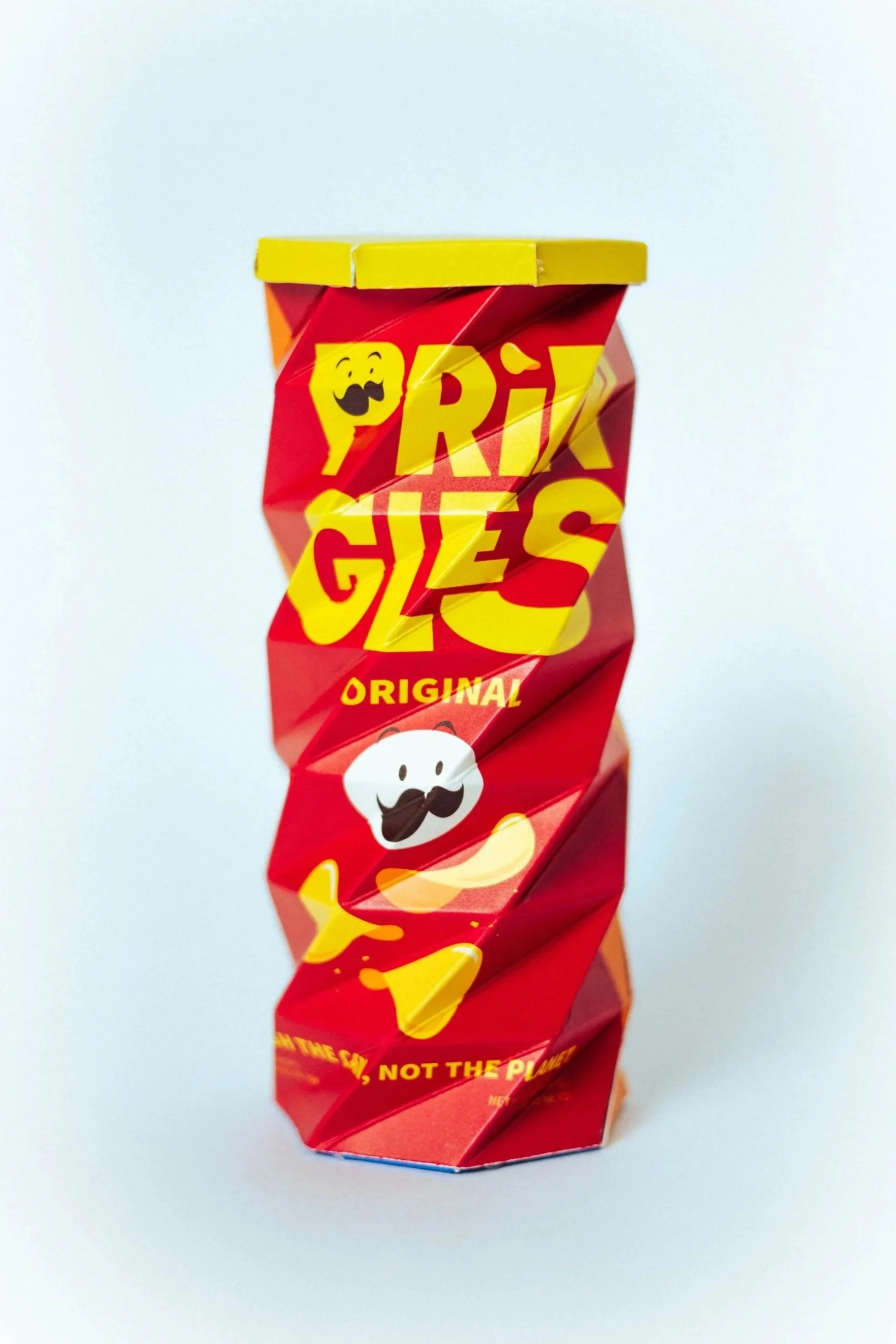
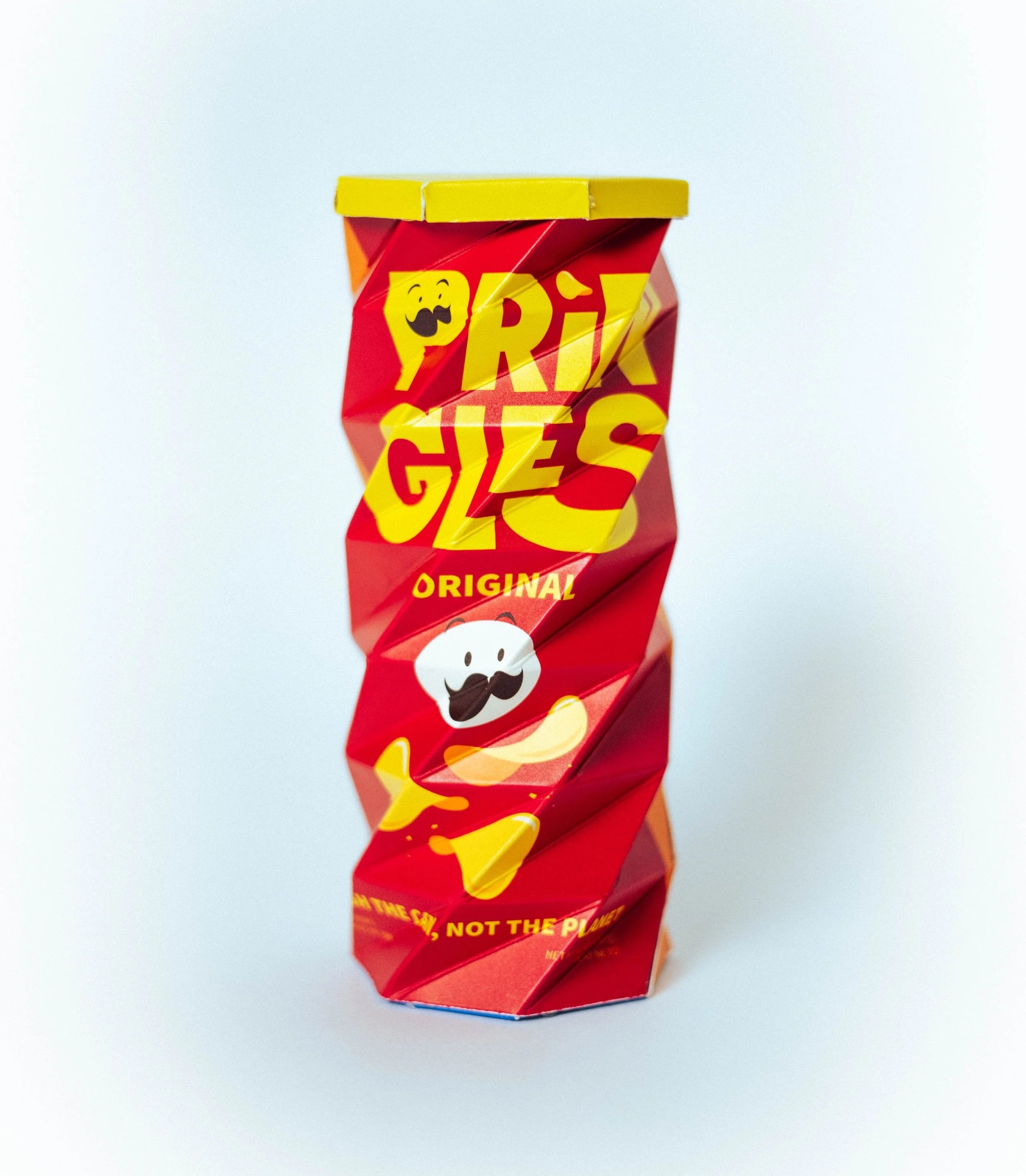
All pieces fit well together, the structure accommodates chips perfectly, and the can is easily compressible.
SOLUTION
Final Dieline & Package Graphics
SOLUTION
Finished Product
CHECK OUT ANOTHER PROJECT!
UX/UI • SERVICE DESIGN • CLIENT PROJECT
Mr. Turtle
DISNEY DESIGN COMPETITION • VISUAL DESIGN